A Complete Guide to Hockey Team Jerseys In Heated Rivalry
A deep dive into the team jersey designs and meanings of Heated Rivalry
(This deep dive is written in collaboration with u/thecompanion188. A big thank you for their incredible research and for allowing HR Wiki to adapt the original Reddit post. Check out her post for some interesting comparison between the designs on the show vs their real-life counterparts!)
One of the most immersive parts of the Heated Rivalry TV adaptation is the incredible attention to detail in the costume department. To bring ice hockey to life, Heated Rivalry's costume designer Hanna Puley had to create dozens of distinct, realistic hockey jerseys. Unless stated otherwise, all the photos in this deep dive are from her Instagram post with supplementary screencaps from the show.
In this deep dive, let's break down all the major jersey designs featured in Heated Rivalry, as well as some of their real-world inspirations.
Boston Raiders

Worn by Ilya Rozanov, the Boston Raiders' home jersey features a black base with sharp red and white striping along the bottom hem and sleeves. The central crest mimics the real-life Boston Bruins' spoked wheel, but it features a large letter "R" overlaid with a massive cannon. Staying true to Tierney’s innuendo design for the team logos, the Raiders' logo leans heavily into Ilya's role as a top in his relationship with Shane.
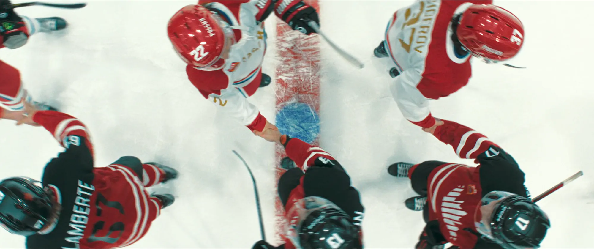
In the MLH, you'll notice a clear distinction between home and away jerseys. Typically, Home jerseys feature a darker base color, while Away jerseys have a primarily white base. (Note: There are times in the real league when an away team may wear their home jerseys, or both teams wear their home jerseys, but standard rules apply most of the time).

Montreal Metros

The Montreal Metros jersey features a classic royal blue base with thick white and red horizontal striping across the chest, sleeves, and socks. However, director Jacob Tierney confirmed on the What Chaos! podcast that the art department intentionally designed the fictional logos as sexual innuendos reflecting the characters' bedroom preferences. Because Shane is a bottom, the Metros' stylised "M" logo is cleverly shaped to look like a pair of legs bent over, complete with a strategically placed fleur-de-lis right in the center. It's impossible to unsee once you notice it.

New York Admirals
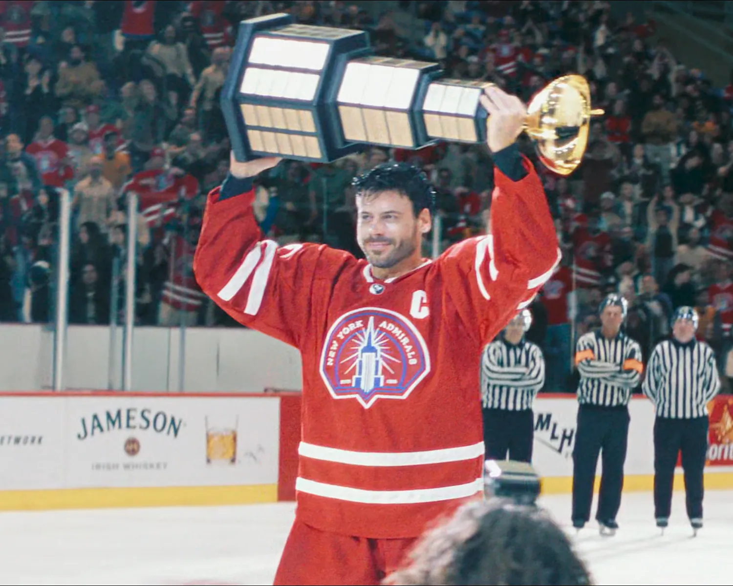
The New York Admirals stand out in a vibrant red jersey accented by bold white striping across the elbows and waistline. Captained by Scott Hunter, the Admirals’ logo follows the exact same cheeky design rule as Boston's. The front crest features a towering, phallic-looking skyscraper that heavily resembles the Empire State Building.
The letters on the chet represent team leadership: 'C' stands for Captain, and 'A' stands for Alternate Captain, like this one on the Away jersey of New York Admirals.

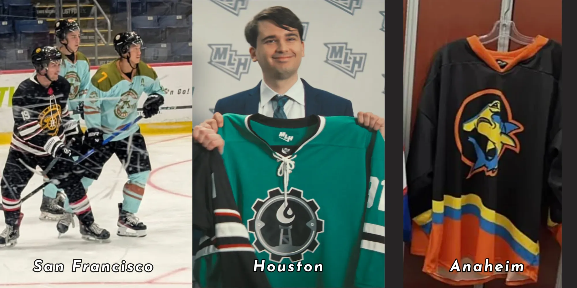
MLH Western Conference: Miscellaneous Teams
Here are 3 other team jerseys that we have seen on the show, San Francisco, Houston and Anaheim:
2008 International Prospect Cup
The International Prospect Cup is the Heated Rivalry universe's fictional version of the World Junior Championship (WJC) - a massive real-life tournament for the top 10 national teams around the world. The tournament always starts on December 26th and runs through January 5th. While most players are 18 to 20 years old, there are some exceptions. Players who are exceptionally good at hockey can sometimes play in the tournament when they are only 17.


2014 Nashville All-Star Games
The All-Star Game is an annual event held by the league. Typically, it follows an Eastern vs. Western Conference format, but there have been variations. For example, from 1998-2001, the real NHL chose to do a "North America vs. the World" format. Here are the Team Europe and Team North America jersey designs on the show:


2017 Tampa All-Star Games
The Eastern & Western Conference All-Star jerseys in the show feature a similar star motif to some of the real jerseys the NHL has designed for the event over the years. The 2023 real-life ASG jerseys (worn by Connor McDavid and Sidney Crosby) are a great example of this, featuring an amazing retro color scheme.


2014 Sochi Winter Olympics
The "Lost" Designs: According to the show’s costume designer, Hanna Puley, Episode 2 was originally going to feature a game where Russia loses to Germany. However, that section was changed to Latvia and cut before any Germany jerseys were produced.
